
Dino Docs
Project Overview
Dino Docs is a kid-friendly, collaborative document editor that makes writing, collaboration, and creative learning feel approachable for elementary school students. As the sole designer on the team, I led the full design process while working closely with my teammates on ideation, strategy, and feature scoping. The result is a platform that gives children the tools to create and share schoolwork while giving teachers and parents the visibility they need to support them.
Timeline
Nov 2024 – Dec 2024
2 months
Tools
Figma
Figjam
Role
UX/UI Design Lead
Team
Cyrus Liu, Calvin Nhat Nguyen, Elane Elza Shane, Benjamin Wargowski
The Problem
Many students struggle to stay engaged with digital learning tools, especially at younger ages. Traditional platforms feel overwhelming, repetitive, or designed for adults — making it hard for kids to build consistent study habits or express themselves creatively. Teachers and parents, meanwhile, need structure and oversight without sacrificing the playfulness that keeps kids engaged.
Three questions guided the project:
- How should users input their preferences without it feeling like a survey?
- What's the right level of detail on a discovery card?
- How do we make filtering feel fast, not tedious?
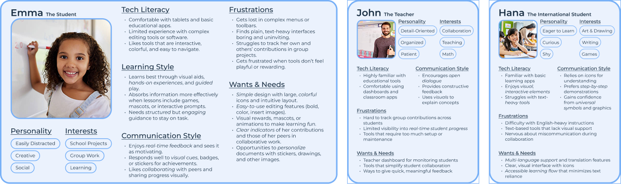
Understanding the Users
Personas
We built three personas to represent the full ecosystem of people this product serves, including students and teachers.
User Stories
Building on our personas, I translated each user's needs into concrete stories with explicit acceptance criteria. These kept design decisions grounded in real requirements rather than assumptions and gave the team a shared, testable definition of "done."
Students
- Collaborating with classmates in real-time, with live edits shown through colored highlights indicating who is editing where
- Autosaving automatically, with a visible confirmation so kids never worry about losing work
- Working offline and syncing changes when reconnected, with a simple conflict resolution flow ("Keep Old Widget" / "Combine Changes") designed for younger users
- Adding images easily, without layout complications — images insert as full-width widgets with caption options
International & Accessibility Needs
- Language selection that translates UI elements, making the app usable for non-English-speaking students
- High-contrast mode and screen reader compatibility for students with visual impairments
- Guided navigation mode with step-by-step interactive prompts for users who need additional support
Parents & Teachers
- Linked parent accounts with supervisory capabilities over a child's profile
- Alerts for flagged or inappropriate content so teachers can address issues quickly
- Collaboration restrictions allowing parents to control exactly who a student can share documents with
- A teacher dashboard with document activity logs, contribution history, and the ability to comment or assign tasks directly in the app
These stories gave the team a shared language for what "done" looked like, and helped prevent scope creep by grounding feature discussions in user needs.
Ideation
Exploring Three Directions
Rather than jumping to a solution, I led the team through a structured evaluation of three fundamentally different approaches to the problem. The goal was to pressure-test assumptions before committing to any direction.
Approach 1 — Simplified Google Docs
A pared-down version of Google Docs, keeping only the most essential features for kids: a simple toolbar, fixed layouts, real-time collaboration.
- Key Features: Simple toolbar, fixed layouts, real-time collaboration.
- Pros: Familiar, uncluttered, and collaborative.
- Cons: Still requires some guidance; may feel too close to “grown-up” tools.
Approach 2 — Modular Widgets
Selected Documents built from self-contained drag-and-drop blocks: title, subtitle, paragraph, image, list. Children add, remove, or rearrange widgets without needing to understand formatting rules or layout logic. Each widget surfaces only the tools relevant to it — text blocks show formatting options, image blocks show caption and alignment tools. Clean, structured, and naturally encourages logical thinking about how documents are organized.
- Key Features: Widget-based sections, drag-and-drop reordering, minimal context-specific tools.
- Pros: Easy to understand, keeps interface clean, encourages structured thinking.
- Cons: Limited flexibility compared to free-form editing.
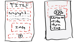
- Preliminary sketches:
Approach 3 — Guided Prompts
A step-by-step experience walking students through pre-defined sections with structured prompts ("What's your document about? Type your title here!").
- Key Features: Pre-defined sections, structured prompts, simple formatting.
- Pros: Provides structure, reduces confusion, great for beginners.
- Cons: Too restrictive for older/more advanced kids.
Why Modular Widgets Won
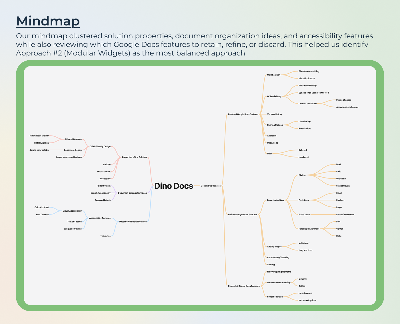
I built a mindmap to crystallize the decision, mapping solution properties, document organization options, accessibility requirements, and a keep/refine/remove audit of Google Docs features. Three things made Approach 2 the clear choice: it was accessible enough for a 7-year-old, flexible enough for a 12-year-old, and structured enough that a teacher could trust what students were producing.
The mindmap also surfaced which Google Docs features to retain (real-time collaboration, autosave, lists, basic formatting, sharing), which to refine (image placement, inline-only rather than free-float, to avoid layout chaos), and which to discard entirely (columns, tables, sub-menus, advanced formatting).
Key Design Decisions
Context-aware toolbars, not a universal toolbar.
One of the most consistent frustrations across child-facing apps is toolbars that show every possible option at once. I designed each widget to surface only the tools relevant to its content type: a text widget shows bold, italic, font size, alignment; an image widget shows caption and placement. This kept the interface uncluttered and made the right action feel obvious without requiring a child to scan through irrelevant options.
Widget locking during collaboration.
Real-time collaboration with young users creates a specific problem: two children editing the same sentence simultaneously produces confusion, not collaboration. The solution was to lock the widget a user is actively editing, preventing conflicts at the source rather than trying to resolve them after. Only the active widget is locked so collaboration feels fluid rather than constrained.
Offline-first conflict resolution designed for children.
When a student edits offline and reconnects, traditional merge UIs (diff views, version trees) are completely inaccessible to a 9-year-old. I designed a simple reconciliation flow that duplicates the conflicting widget and presents two clear options: "Keep Old Widget" or "Combine Changes." No technical language, no overwhelming comparison view, just two clearly labeled choices with a plain-language explanation of what happened.
Removing features was as important as adding them.
Columns, tables, free-form image placement, sub-menus, custom fonts all were deliberately excluded. Not because they're not useful, but because they add cognitive load without adding value for a child completing a school assignment. Every feature that wasn't included was a considered decision, not an oversight.
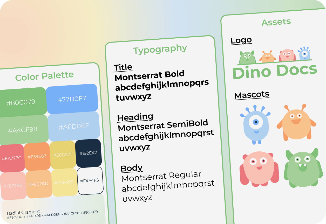
Branding & Style Guide
The visual language had to strike a specific balance: playful and safe enough that kids feel at home, but structured and clean enough that teachers and parents trust it with classroom work. The color palette, typography, and mascot system were all developed with this balance in mind.
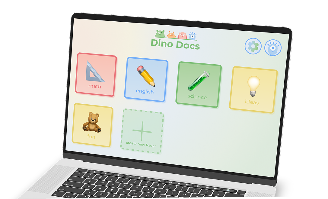
Final Design
Dino Docs provides a playful yet structured learning environment where students can create, edit, and share projects with ease. Mascots appear throughout the experience to guide, celebrate, and encourage, without getting in the way of actual work.
Feature Walkthrough
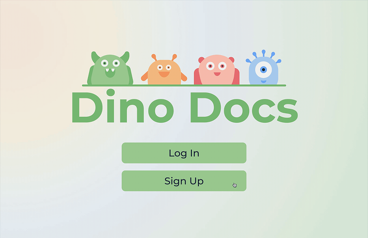
Welcome & Onboarding
Onboarding introduces the mascot and sets the tone immediately: friendly, safe, and easy.
Students select their role (student, teacher, parent), choose a username, set a password, and pick a profile avatar.
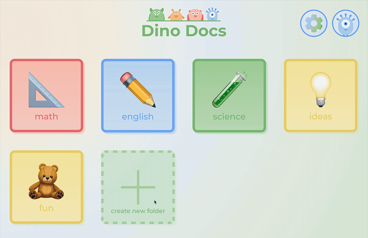
File System & Folder Organization
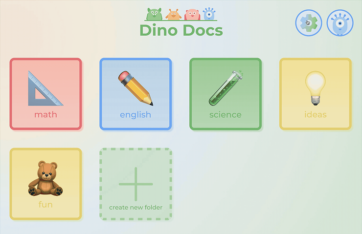
Students land on a home screen showing their folders and documents.
Color-coded folders let children organize their work visually without needing to read labels.
Creating a new document prompts for a name and a template (Essay Outline, Meeting Notes, blank), then drops the user directly into the editor.
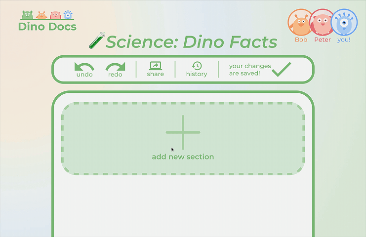
Modular Widget File Editor
The core editing experience. Students tap the "+" button to add a widget, choose the content type (title, subtitle, paragraph, list, image), and see context-specific tools appear for whichever widget is selected.
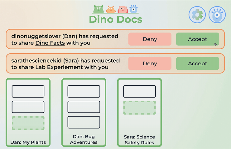
Parent & Teacher View
A shared dashboard showing all documents linked to the account, incoming sharing requests, and the ability to accept or deny collaboration.
Teachers see class-level activity; parents see their child's document history.
Accessibility Settings
Light/dark mode, small/medium/large text sizing, and language selection (English, Spanish, French, Japanese shown) are accessible from a single settings screen.
What's Next
Usability testing with actual children.
Every design decision in Dino Docs was grounded in research and careful reasoning — but none of it was tested with the primary users due to project limitations. The single highest-value next step is putting the prototype in front of real 7–12 year olds and watching what breaks. Children interact with interfaces in ways adults don't predict, and the conflict resolution flow in particular needs real-world validation before it can be considered solved.
Teacher assignment and template integration.
Right now, teachers can monitor student documents but can't initiate work from their side. A direct "assign document" flow, where a teacher creates a template, assigns it to students, and receives completed work, would transform Dino Docs from a tool students use independently into a genuine classroom workflow tool. That integration is what would drive adoption at the school level rather than just the individual level.
Refining the collaboration locking model.
Widget-level locking prevents editing conflicts, but it also means a student can block a section of a document indefinitely simply by having it selected. A timeout system — locking releases after a period of inactivity — would make collaboration feel more fluid without reintroducing the conflict problem the locking was designed to solve.
Key Takeaways
Designing for multiple stakeholders requires holding all of them in mind simultaneously.
Dino Docs isn't a product for kids, it's a product for kids and teachers and parents and students with disabilities and international students. Every decision had to work for a 7-year-old creating their first document and a teacher monitoring thirty students at once. The moments where those needs conflicted were the most interesting design problems on the project.
User stories made abstract needs concrete and kept the team aligned.
Turning persona insights into explicit user stories with acceptance criteria changed how the team talked about features. Instead of debating what "collaboration" should look like, we had a testable definition to design toward. It also made scope decisions easier, if a proposed feature couldn't be expressed as a user story with a clear acceptance criterion, it probably wasn't ready to be built.
Constraints fuel creativity.
Designing for young children meant removing nearly every default design assumption, no complex navigation, no dense text, no hidden features. Working within those constraints pushed us toward solutions that were genuinely simpler and more intentional than what we might have built for a general audience.