
Gem
Project Overview
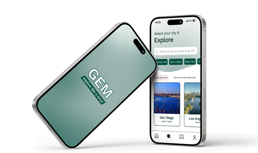
GEM is a travel discovery app I designed as part of a cross-functional fellowship through Product Association @ UCI. As the sole designer on the team, I owned the full design process — from initial research synthesis and wireframing through two rounds of usability testing and the final high-fidelity prototype. The final product is GEM, a travel discovery app that helps young adults find hidden local gems tailored to their interests, cutting through the noise of social media and overcrowded review platforms to surface experiences that actually feel special.
Timeline
Jan 2023 – May 2023
5 months
Tools
Figma
Figjam
Jira
Outcome
1st Place — Judged by industry professionals
Role
Product Designer
Team
Isabelle (Product Marketer), Justin (Product Manager), Gianna (Product Developer), Nicholas (Product Developer)
The Problem
Travel inspiration today is messy. Thirty-four percent of travelers turn to TikTok for trip ideas, but extracting useful recommendations requires scrolling through hundreds of videos, cross-referencing multiple sites, and still often landing at the same overrated spots everyone else visits.
How might we help travelers quickly discover hidden local gems that match their unique interests?
Research & Discovery
User Interviews
Our target audience was young adults (18–35) seeking authentic, personalized travel experiences. After conducting interviews and synthesizing findings into personas, three clear pain points emerged:
- 75% felt existing apps didn't reflect a local's perspective — just tourist traps
- 85% found current app organization cluttered and unmanageable
- 71% described finding new places as "time-consuming and overwhelming"
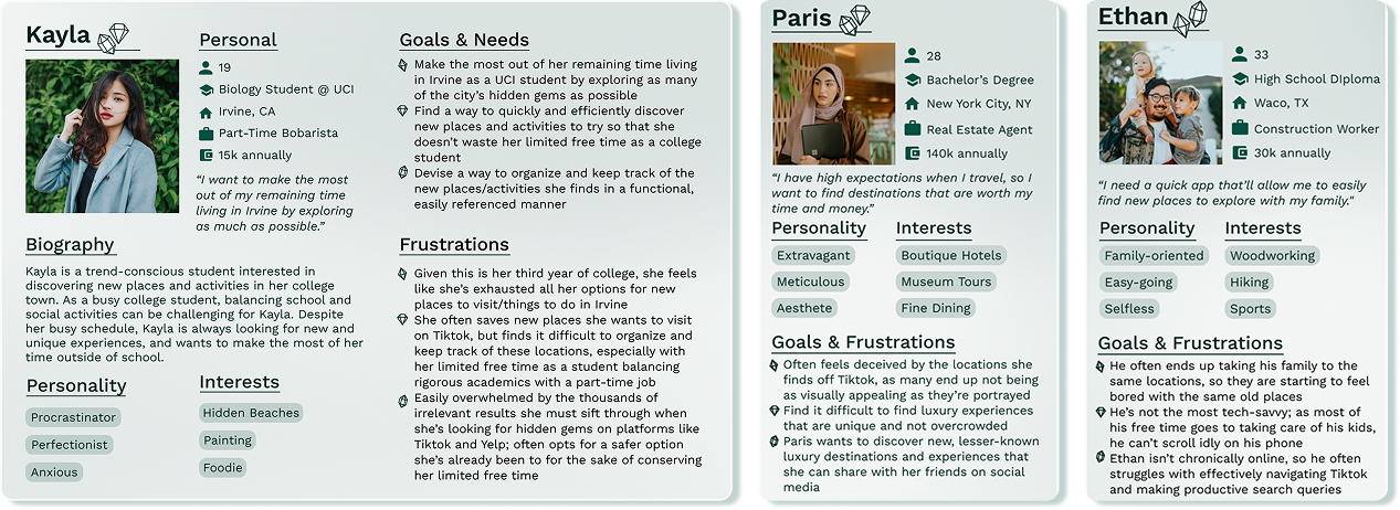
Personas
To understand who we were designing for, we synthesized the interview findings into three personas representing the core range of GEM users, from the frequent weekend explorer to the spontaneous traveler landing somewhere new.
Competitive Analysis
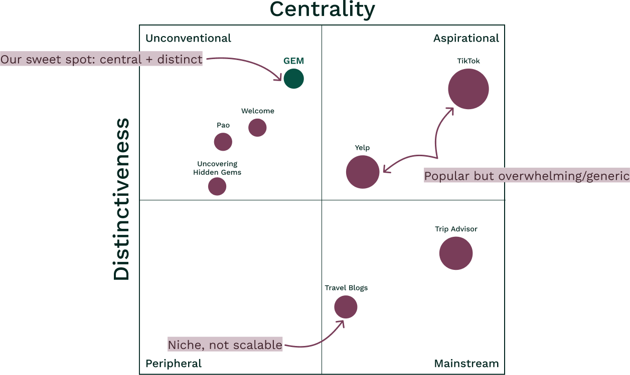
I mapped GEM against the main players: TikTok, Yelp, TripAdvisor, travel blogs, and niche apps. The pattern was clear: tools with wide reach lacked local authenticity, and tools with authentic content lacked usability.
GEM was positioned in the Unconventional + Central quadrant: mainstream enough to be easy to use, distinctive enough to surface genuinely local recommendations.
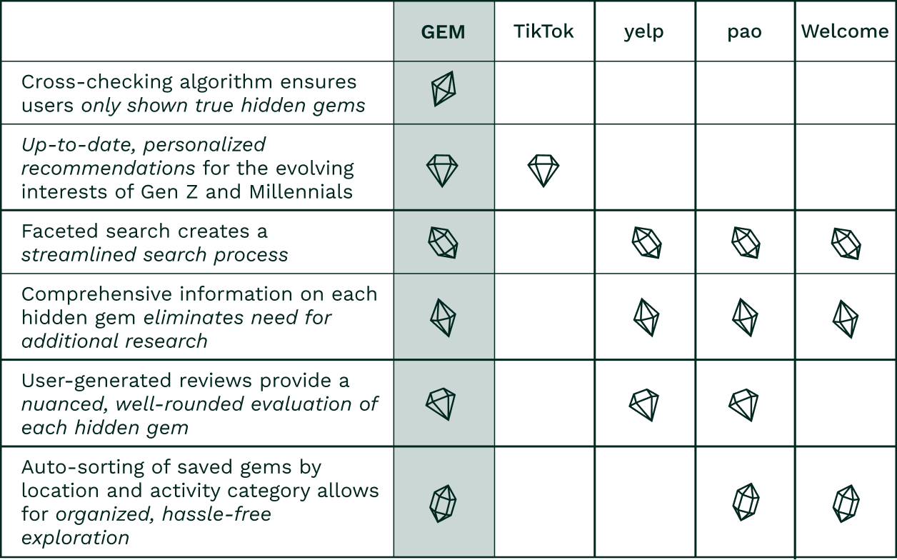
A feature comparison reinforced the gap. TikTok and Yelp win on reach, but neither offers streamlined search, reliable filters, or any cross-verification of recommendations. GEM's differentiators — a cross-checking algorithm, faceted search, and auto-sorting — directly address the manual research burden users described in interviews.
This gap directly shaped the design brief: GEM needed to feel curated and personal, not comprehensive and cluttered. Every feature decision that followed was filtered through that standard.
Design Process
Sketches & Wireframes
I began with rough sketches to explore layout options and core interaction patterns before committing to any structure. Early questions I was working through:
- How should users input their preferences without it feeling like a survey?
- What's the right level of detail on a discovery card?
- How do we make filtering feel fast, not tedious?
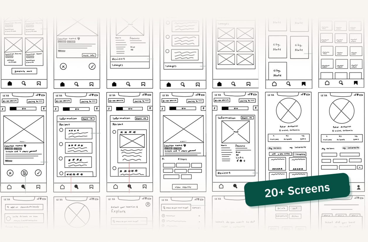
I iterated across 20+ screens, consistently testing flows with mentors and teammates before moving forward.
Key Design Decisions
Cards over lists.
Early designs used list-based layouts for displaying gems — familiar, but they required reading to differentiate options. I moved to a card-based system with visual metric sliders (affordability, photoworthiness, accessibility) so users could evaluate a location at a glance without parsing text. This directly addressed the 85% of users who described existing apps as cluttered and unmanageable.
Preferences upfront, not buried in settings.
The onboarding flow captures user interests before showing any recommendations, so the very first thing a user sees is already relevant to them. This was a deliberate trade — slightly more friction at entry for a significantly better first impression. Testing validated it: users who completed onboarding engaged more meaningfully with their initial recommendations than those who skipped it.
Cross-checking as the trust mechanism.
One of the most common interview frustrations was not knowing whether a recommendation was genuinely good or just well-marketed. Rather than relying on a single source, GEM's algorithm cross-references multiple signals. I worked with Justin and the developers early to understand what was technically feasible, then designed the UI to communicate this verification to users in a way that felt trustworthy rather than technical.
Social without social anxiety.
The "Friends' Picks" feature lets users see where their social circle has been without introducing likes, follower counts, or public performance pressure. Discovery as a shared conversation, not a competition.
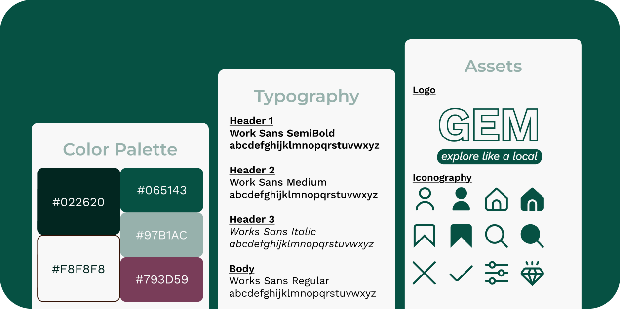
Branding
GEM's visual identity is understated and grounded in order to let destinations take center stage rather than compete with the UI around them.
Usability Testing
Round 1 — Mid-Fidelity
A small group of beta users tested the functional prototype. Feedback focused on overall flow, navigation clarity, and whether the core concept resonated. Mentor designers provided a parallel layer of expert critique.
Round 2 — High-Fidelity
With changes implemented, I ran a second round focused on visual design, interaction detail, and consistency. I kept our personas front of mind throughout, asking at each decision point whether this solved the problems our users actually described.
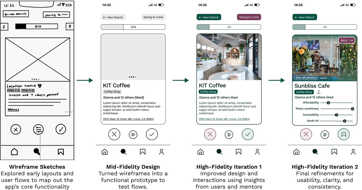
Key improvements across iterations:
- Simplified onboarding — reduced steps required before a user saw their first recommendations
- Redesigned card layout — moved from text-heavy descriptions to visual metrics (sliders for affordability, photoworthiness, accessibility)
- Saved locations tab — reorganized after users struggled to re-find places they'd bookmarked
The Solution
Feature Walkthrough
GEM simplifies and personalizes adventure discovery. By learning your preferences upfront and applying them consistently, every recommendation feels relevant. The core experience is built around four actions:
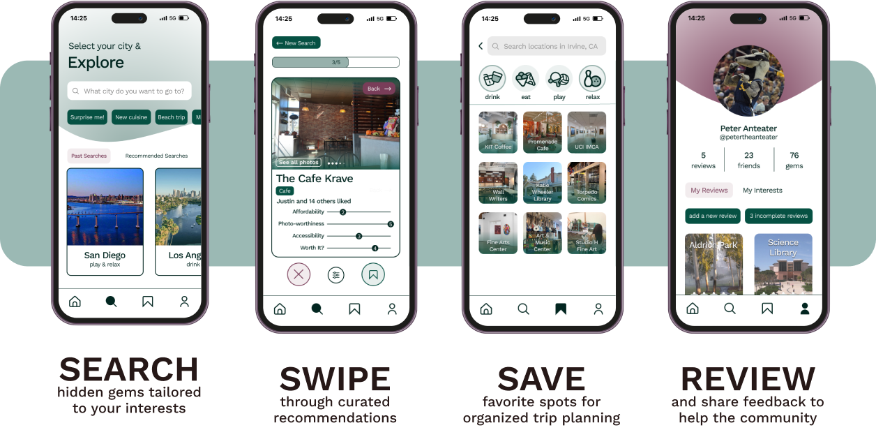
Final Prototype
With two rounds of testing complete and iterations applied, the designs came together into a cohesive experience. Here's the result:
What's Next
Expand Testing
Run usability studies with a broader, more geographically diverse group of travelers to validate that GEM's model works globally, not just for students in a single region. Collect longitudinal feedback to understand how GEM fits into real trip planning over time.
Personalization & Machine Learning
Use ML models to improve recommendations over time, learning from saved gems, reviews, and travel patterns. Explore mood-based search inputs (e.g., "adventurous," "cozy," "low-key") that reflect how people actually think when planning.
Accessibility & Global Reach
Add multilingual search and culturally specific recommendations. Build an offline mode for travelers who explore without reliable connectivity.
Key Takeaways
Narrowing scope created focus.
Our original concept was broad, basically a location search tool. With mentor guidance, we honed in on hidden gems specifically. That constraint gave GEM a clear identity and made every design decision easier to evaluate. It also, ultimately, led to winning first place in the fellowship.
User feedback shaped the product more than any assumption.
Nearly every meaningful improvement across our iterations came directly from what users showed us during testing, things we could not have predicted from behind a screen. This process reinforced how much listening matters in the design process.
Cross-functional teams make better products.
This was a genuine team effort, from early whiteboarding to late-night iteration sessions. Collaborating closely with Isabelle, Justin, Gianna, and Nicholas showed me how much stronger a product becomes when every discipline is in the room from the start. As the sole designer, I also learned to articulate design reasoning to non-designers, explaining why a decision mattered, not just presenting it. That habit made both my work and the collaboration sharper.