
Roam
Project Overview
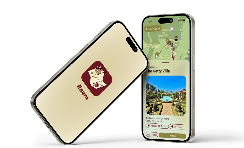
Roam is a scavenger-hunt style exploration app that turns everyday outings into guided adventures. Users create or join "roams" — customizable, bite-sized routes through their city — then earn points, share experiences with friends, and discover local spots they'd never find on their own. As design lead, I guided the team's design direction, established the shared design system that allowed us to work in parallel, and led all usability testing. Individual sections were wireframed collaboratively, with each designer owning a core flow before we reconciled everything into a unified system.
Timeline
Oct 2025 – Dec 2025
3 months
Tools
Figma
Figjam
Airtable
Role
UX/UI Design Lead
Team
Pacey Diep, Souzen Khan, Samanta Jimenez Sandate, Lana Wang, Fatima Waqar
The Problem
Picture this: It's Saturday afternoon and you want to do something new. You open Yelp, scroll for twenty minutes, don't love anything, switch to TikTok for inspiration, get distracted, eventually text your friends — and end up at the same place you always go.
This isn't a lack of options. It's a lack of the right tool.
Boredom and social disconnection are quietly growing problems in the U.S.: 1 in 5 adults report feeling lonely and disconnected, and 27% say their lives feel "a bit boring." Meanwhile, people who do want to get out are cobbling together a patchwork of apps — Yelp for reviews, TikTok for inspiration, Google Maps for navigation — none of which were built for guided, real-world exploration, and none of which talk to each other.
The result is decision fatigue, duplicate effort, and a lot of cancelled plans.
How might we help people break out of routine and discover their surroundings, without the friction?
Research
User Surveys
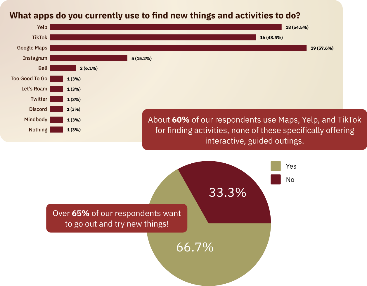
We surveyed 33 participants about how they currently discover activities and plan outings. About 60% relied on Google Maps, Yelp, or TikTok — none purpose-built for interactive, guided exploration. Over half said they genuinely wanted to get out and try new things more often but didn't have a clear path to act on it.
Competitive Analysis
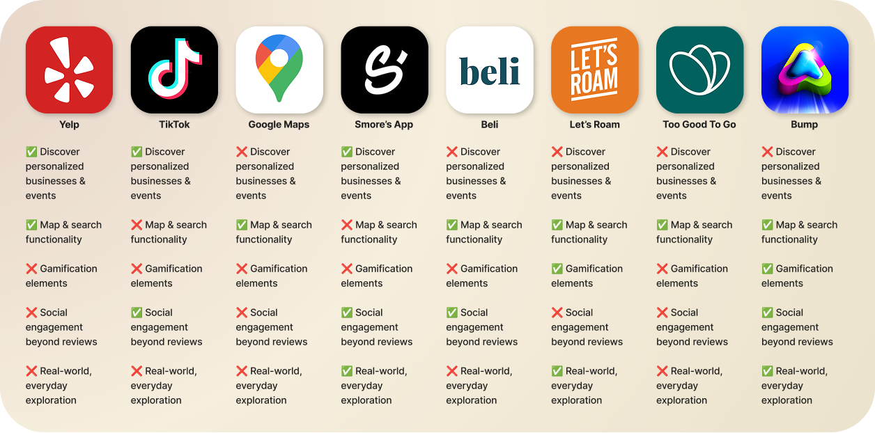
We mapped eight competitors, Telp, TikTok, Google Maps, Smore's App, Beli, Let's Roam, Too Good To Go, and Bump, against five criteria: personalized discovery, map functionality, gamification, social engagement beyond reviews, and real-world everyday exploration.
No single competitor checked all five boxes. Bump came closest at four, but still lacked personalized discovery. That gap was our opening, and it directly shaped which features Roam needed to lead with. A product that didn't offer all five wouldn't be meaningfully different from what already existed.
User Personas
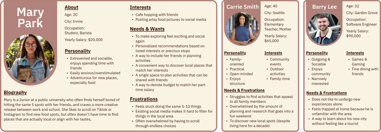
Roam is for people who feel stuck in routine and want an easier, more exciting way to discover what's around them. We developed three personas to capture the range of users, from the college student bored of the same five spots, to the mother of three trying to plan a weekend everyone will actually enjoy, to the new-to-town software engineer who doesn't want to feel like a tourist.
Design Process
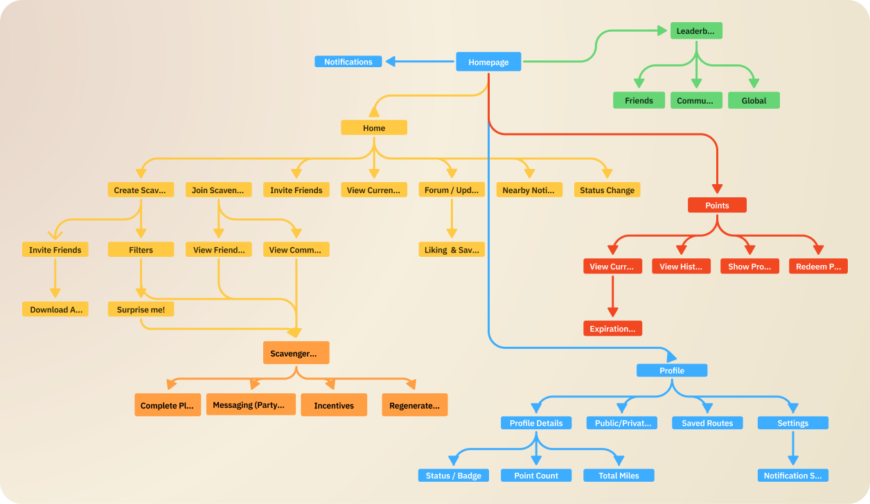
Information Architecture
Before touching wireframes, we mapped the full structure of the app to give the team a shared foundation. This was critical given that six designers were about to work in parallel across five different sections.
The IA is organized around five main pillars accessible from the homepage: Home, Leaderboard, Profile, Notifications, and Points/Rewards. Home houses the core user flow — creating roams, joining friends, browsing community routes, and accessing nearby notifications. The active Scavenger Hunt experience lives nested within Home as the primary action. Leaderboard branches into Friends, Community/County, and Global views. Profile covers identity, saved routes, and settings.
Getting this structure right upfront meant that when teammates worked on different sections, everything could be reconciled into a single, coherent system.
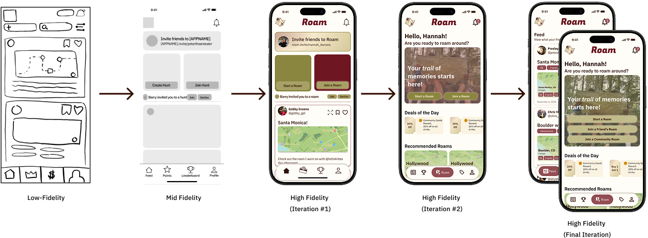
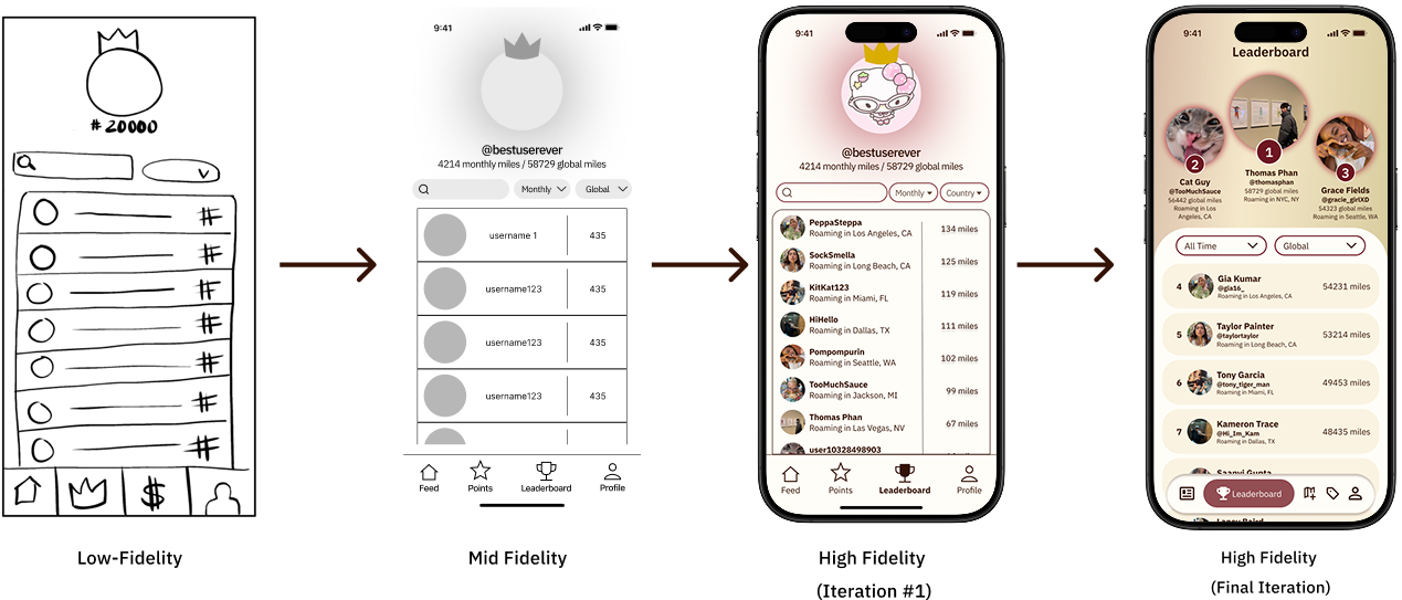
Wireframes
We moved through three fidelity stages: low-fi sketches to explore layout, mid-fidelity grayscale frames to establish structure, and multiple high-fidelity rounds where branding and real content were introduced. Each major section — Feed, Profile, Scavenger Hunt, Leaderboard, Points — was wireframed by individual team members working from the shared IA, then reconciled through a shared design system I established.
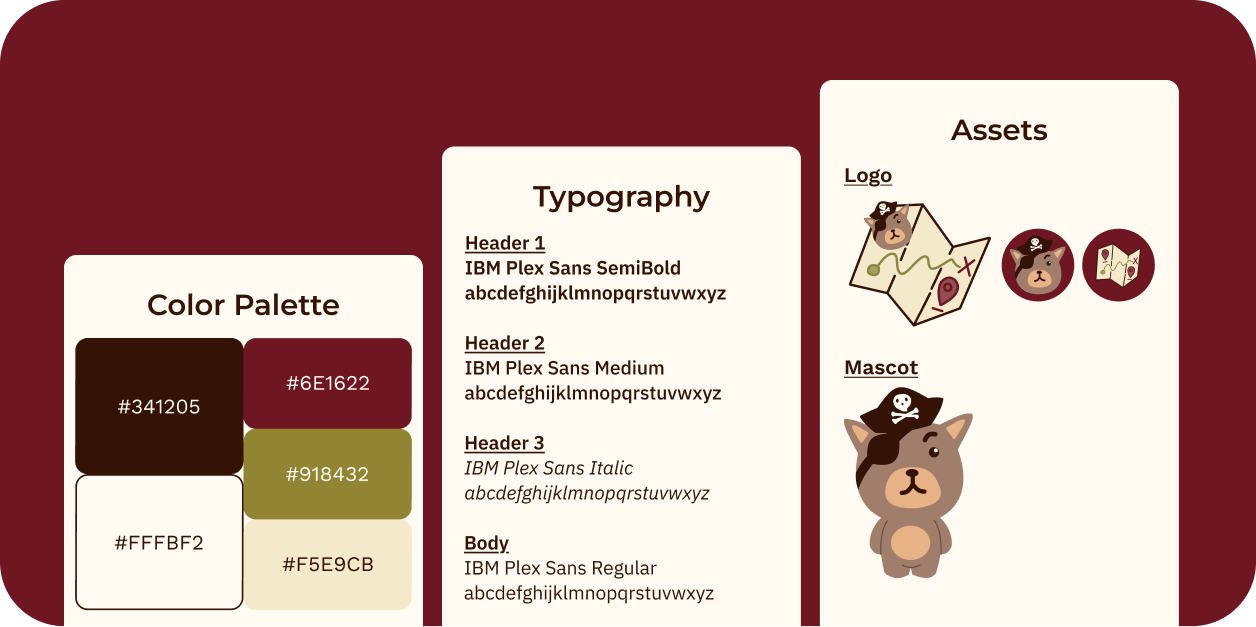
Branding
Roam's visual identity leans into the spirit of adventure: warm, earthy, and a little playful. The mascot, a small pirate bear, sets the whimsical, exploratory tone without sacrificing the legibility and professionalism the interface needs to actually function.
Usability Testing
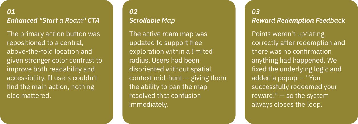
With our high-fidelity prototype ready, we ran usability tests and surfaced three significant pain points.
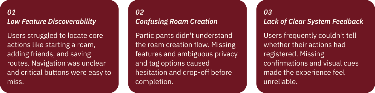
Each finding mapped directly to a design change — no guessing required.
Iteration
Home
The home screen shows the most visible evolution across the project. It moved from a rough sketch through a mid-fi wireframe with placeholders, then a first high-fidelity pass that introduced branding but conflated two distinct user needs, discovery and social, into a single cluttered screen. The second iteration made the most significant structural change: splitting the home screen into two separate pages. The Roam page became focused purely on starting and joining roams, while the Feed became its own dedicated space for social activity. This separation clarified the product's hierarchy and gave each mode room to breathe. The final version refined the Roam page further with the drawer layout, making the primary CTA impossible to miss while keeping recommended roams and daily deals within reach.
Leaderboard
The leaderboard went from a plain ranked list to a podium-style top-three display with profile photos, real-time location context, and dual filter dropdowns. The final version feels like a competitive social feature, not just a table.
Final Design
Feature Walkthrough
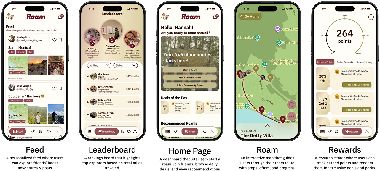
Final Prototype
After three months of research, iteration, and testing, here is the finished product:
Key Takeaways
Nothing feels intuitive until you watch someone actually use it.
Features we thought were obvious, such as reward redemption, roam creation, needed significant rethinking once real users got their hands on the prototype. Usability testing didn't just surface bugs; it changed our understanding of the product's hierarchy entirely. What felt logical to us as designers was invisible to someone encountering the app for the first time.
Restraint is a design decision.
The IA we built is ambitious, and there were moments where we had to deliberately scope down in order to build any one feature well. Every decision became a negotiation between what was ideal and what was executable. Learning to make that call, and justify it, was one of the most valuable skills this project sharpened.
Structure enables parallel work.
With six designers working simultaneously, the IA and shared design system weren't just organizational tools, they were what made collaboration possible. Building that foundation early meant we could move fast without stepping on each other, and reconcile our work without starting over.